Employment at NYSUT, Jun 2023–Oct 2025. Personal contributions during that role; this is not a contract attributed to Limit Break Marketing.
Role
Website design & development
Scope
Led modernization involving Salesforce migration, IBM integration and test environments; enhanced PHP, JavaScript and SQL event systems, built Drupal modules and themes, and developed Power BI and Tableau reports.
Deliverables
Migration and integration work, event attendance and badge-system improvements, responsive publishing components and operational reports.
Outcome
Completed modernization work across enterprise applications, publishing and event operations, with reports for organizational use.
Engagement
Employment at NYSUT, Jun 2023–Oct 2025. Personal contributions during that role; this is not a contract attributed to Limit Break Marketing.
The public-site capture provides context and may include later changes. Internal systems and confidential data are omitted.
Prior professional experience supports the founder’s qualifications. Public website observations below are separate from verified delivery facts and measured outcomes.
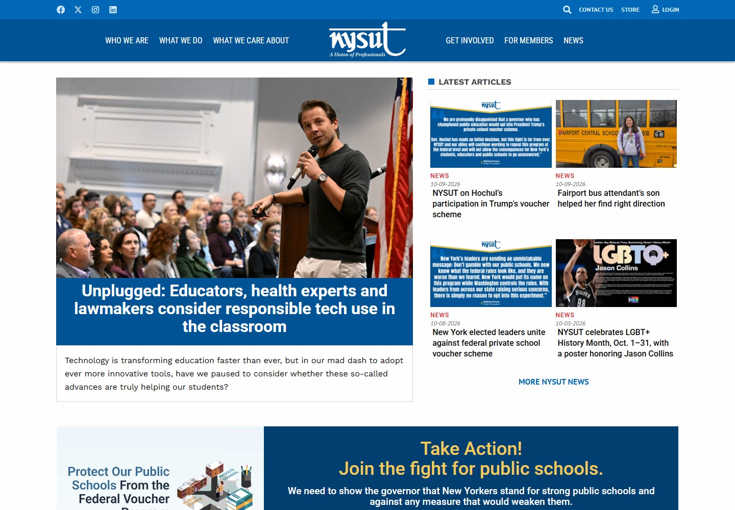
NYSUT’s website presents a wide mix of organizational information, editorial updates, resources, and participation opportunities. The homepage demonstrates how a substantial content offering can be arranged into a readable hierarchy rather than a single undifferentiated feed.
↗A purposeful news hierarchy↗Useful resource groupings↗A clear path from information to participation
Public-site observations
What makes it work.
Observations about the captured public experience. Current features may include later work by other teams; these observations do not establish the founder’s ownership of each design choice.
01✦
A clear editorial hierarchy
The opening places a large featured story beside a smaller grid of recent articles. Photography, category labels, dates, and headline sizes distinguish the main feature from the supporting items. This gives a visitor more than one entry point while still making it clear where the page’s strongest editorial emphasis sits.
02✦
Several audiences, organized by intent
The primary navigation groups organization information, activities, priorities, participation, member information, and news. Further down, resources and quick links create practical shortcuts. The combination helps a content-heavy site serve both exploratory readers and people arriving with a specific task in mind.
03✦
An advocacy message that has its own space
The public-school action section uses a distinct panel, a clear heading, and a visible petition route. Separating this appeal from the article grid gives it a different role on the page. It connects an organizational priority to a concrete next step while leaving the editorial content readable.
04✦
A consistent publication system
Press items, dated resources, publications, initiatives, and member benefits each have identifiable sections. Repeated labels and visual patterns let people recognize what kind of information they are seeing. That consistency is valuable when a website needs to support both changing stories and long-lived resources.
Bring the thinking to your business
A useful lesson. A stronger next move.
A content-rich website needs editorial judgment as much as visual design. Give the main story a clear place, then organize the rest around what people came to do.
Employment at NYSUT, Jun 2023–Oct 2025. Personal contributions during that role; this is not a contract attributed to Limit Break Marketing. Analysis describes the captured public experience. Screenshots captured October 14, 2026; live websites may evolve.