Founder’s prior website design and development contribution. Employer or contracting entity and dates are not published; no direct Limit Break client contract is claimed.
Role
Website design & development
Scope
Website design & development, as recorded in the supplied project history. The observations below describe the captured public site.
Deliverables
A public website with the content and visitor routes described below. Current captures show tangible features; they do not establish marketing performance.
Outcome
Completed website capability described in the public-site observations below. No measured commercial performance is claimed.
Engagement
Founder’s prior website design and development contribution. Employer or contracting entity and dates are not published; no direct Limit Break client contract is claimed.
The captured site may include subsequent changes by other teams. Revenue, lead volume and conversion improvements are not claimed.
Prior professional experience supports the founder’s qualifications. Public website observations below are separate from verified delivery facts and measured outcomes.
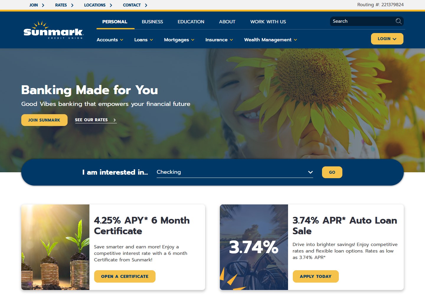
A financial services website serves existing members and people considering a new relationship. Sunmark gives everyday account access, product exploration, and community identity distinct roles in the experience, allowing the site to feel welcoming while still giving visitors a clear way to find the information they need.
↗Distinct member and discovery routes↗A coherent blue-and-gold identity↗Product information connected to community
Public-site observations
What makes it work.
Observations about the captured public experience. Current features may include later work by other teams; these observations do not establish the founder’s ownership of each design choice.
01✦
Navigation separates different visitor needs
The header distinguishes personal and business information, education, and organization details. Product groups such as accounts, loans, and mortgages have their own routes, while login, rates, locations, and contact remain easy to identify. These layers help returning members and prospective customers start from the information relevant to them.
02✦
A helpful choice sits close to the introduction
An interest selector appears near the main introduction and links the opening message to product discovery. The page then presents recognizable financial-solution categories with direct next steps. This gives the broad brand proposition a practical follow-through: visitors can narrow their interest rather than navigating only by promotional headlines.
03✦
Warmth and structure work together
Deep blue navigation, yellow action accents, rounded panels, and welcoming photography give the website a consistent personality. The darker header anchors the experience while lighter sections separate the content. The visual language helps promotional material, practical navigation, and explanatory copy feel like parts of the same institution.
04✦
The relationship extends beyond a product
Community stories, educational resources, career information, and the organization’s local identity appear alongside product sections. This gives visitors several ways to understand the credit union beyond an individual offer. The wider story supports a relationship-led brand while leaving dedicated routes for the specific information a visitor came to find.
Bring the thinking to your business
A useful lesson. A stronger next move.
An approachable brand benefits from clear structure. Give existing customers obvious access, help new visitors find relevant products, and let the organization’s wider identity support the experience.
Founder’s prior website design and development contribution. Employer or contracting entity and dates are not published; no direct Limit Break client contract is claimed. Analysis describes the captured public experience. Screenshots captured October 15, 2026; live websites may evolve.